
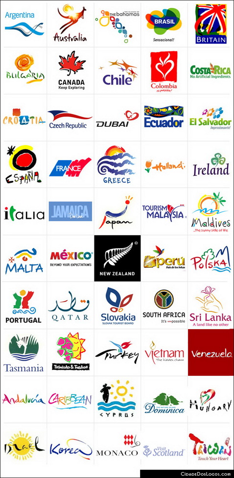
Even if logo design is only a minor facet of nation branding (and sometimes you don’t need it to brand a country), I thought that this table of logos to be relevant. In the end, logos are used to synthesize in a visual and memorable way a country, and as such they can also have their role in a country branding project:


I must say that the analysis here made has no relevance. Comments and opinins were just that. No background on logo design, color choice, images, or anything were made. All elements placed in nation brands are carefully chosen, and in the most part, you can find their explanations easily.
I’m sorry to say but I honestly expected much more.
Thanks for your input Patricia. This post was originally written for my own design related blog, with the sole intention of analyzing these logo designs based on aesthetics; nothing more really. I just thought many of them didn’t look very good, which surprised me considering the designs were representing nations as a whole. That is why I wrote the post.
I agree, it would be interesting to see more insight into the creative branding process the designers chose, but due to the lack of information available online, I chose not to go that route. If anyone has any info into the making of the logos; please share.
Yes, the post is opinion based, but that was the intention. I am not familiar with nation branding and was more interested in critiquing the “look” of the designs – in hope that others would relay off of my remarks and opinions.
Well, I was going to post something like Patricia, about colors and representative elements from the nations on the designs…
But anyways, Now I just want to say that the Colibrí (the bird) on the peruvian logo is not flying off from a “cave” (…), That’s the Colibri from The Nazca Lines in Perú.
I’m sure the signs on the other logos got meanings beyond your eyes as well.
Please do more reasearch before letting go your wild opinion like this.
Juan and Patricia, you win. I’ve asked Andreas to remove my “opinion” from this post, as it’s obviously not an appropriate place for it.I didn’t see the harm in critiquing the logos based purely on aesthetics alone. I’m a graphic designer with limited knowledge of many of these nations, which is why I stated that in the original post.
I was judging the designs based on how they “appear” to an outsider. Whether Peru’s logo features “The Nazca Lines” or a cave, this doesn’t change the fact the beveled look isn’t very appealing for logo use…or how the German logo looks like a big blur when reduced to a smaller size. You can ask just about any designer and they will tell you the same. These logos are used primarily to attract ignorant tourists like myself. They should have meaning..but they should also look good as well. That’s what I was saying. It’s just an opinion…you will see them from time to time.
And Juan, I will do more research the next time I write a post on THE MEANING of these logos, and not the aesthetics alone. Good day.